Introduction
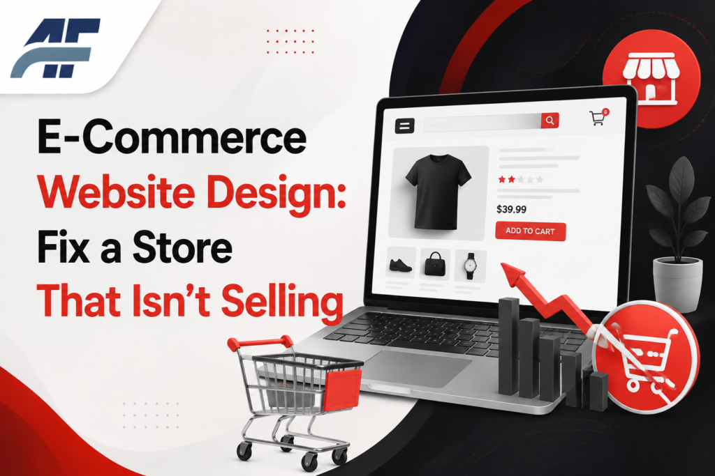
You’ve got a store online. People are visiting it. But the cart stays empty more often than not. That’s not bad luck, it’s usually a design problem hiding in plain sight.
Most people try fixing this by adding more products or running more ads. That doesn’t work, because it treats the symptom, not the cause. If the e-commerce website design itself is confusing, slow, or untrustworthy, more traffic just means more people leaving faster.
This guide walks through the real reasons stores lose sales, and exactly what to change. No vague tips, just fixes you can apply today.
A Brief Response
Quick Answer: Slow load times, unclear navigation, or an excessively demanding checkout are typically the causes of poor sales. Simplify your menu to fewer than seven things, speed up your pages, and reduce the checkout process to as few steps as you can. After these three adjustments, most establishments experience an improvement within a week.
Why Your Store Looks Outdated to Shoppers
Why It Happens
Customers evaluate trust in less than a second. If your product photographs are poor quality, your layout is busy, or your typefaces don’t match, visitors will also conclude that the company behind it isn’t serious.
The Fix
- Pick one clean template. Whether you build with a page builder or code from scratch, stick to one consistent grid, one font pairing, and one color scheme across every page.
- Use real product photos. Shoot products on a plain background with even lighting. Stock images or blurry phone shots hurt more than helping.
- Add white space. Cramming everything onto one screen makes the page feel cheap. Give products room to breathe.
Result
A cleaner layout builds trust fast, and shoppers spend more time browsing instead of bouncing in the first few seconds.
Common Mistakes: Using more than two fonts, or stretching product images so they look distorted.
[RELATED POST: https://ahmadflow.com/]
How to Create an Ecommerce Website That Loads Fast
Why It Happens
A store is slowed down by large, uncompressed photos and an excessive number of plugins. More customers abandon the page before it has even finished loading with each additional second of load time.
The Fix
- Compress every product image before upload. Aim for under 200KB per image without losing visible quality.
- Remove plugins or apps you’re not actively using. Each one adds extra code the browser has to load.
- Turn on caching and use a content delivery network if your platform supports one.
- Test your speed with a free page speed tool and fix whatever it flags as the biggest issue first.
Result
Faster load times keep more visitors on the page long enough to actually shop, which directly improves conversion rate.
Best Ecommerce Website Builder for Your Situation
Why It Happens
Early platform selection might lead to issues later on, such as restricted design control, expensive transaction fees, or an uncustomizable, cumbersome checkout.
The Fix
Compare your options against what actually matters for your store: budget, product count, and how much design control you need.
| Builder | Best For | Limitation |
|---|---|---|
| Shopify | Fast setup, built-in payments | Monthly fee plus transaction costs |
| WooCommerce | Full design control, WordPress users | Needs more setup and hosting knowledge |
| Free store builders | Testing an idea with no budget | Limited templates, harder to scale |
If you’re looking to create online store free first to test demand, start with a free plan and upgrade once you have real orders coming in.
Result
Choosing the right builder from the start saves you a painful migration later, once your product catalog and orders start piling up.
Pro Tip: Always check what happens to your product data and order history if you ever switch builders, before you commit.
Why Shoppers Abandon Your Checkout Page
Why It Happens
Customers have an incentive to dismiss the tab with each additional field, required account setup, or hidden cost at the very end. Hesitancy becomes a lost sale at the point of sale.
The Fix
- Offer guest checkout. Don’t force an account before someone can pay.
- Show shipping costs early, not as a surprise on the final screen.
- Cut the form down to only what you need to ship and bill the order.
- Add trust signals near the payment button, like secure checkout icons or accepted payment logos.
Result
A shorter, more honest checkout process directly reduces cart abandonment and gets more visitors through to a finished order.
How to Design an Ecommerce Web Page That Actually Converts
Why It Happens
A lot of product sites detail the goods but never answer the shopper’s fundamental question: why should I buy this one, right now?
The Fix
- Lead with a clear, benefit-focused headline instead of just the product name.
- Add real customer reviews near the top of the page, not buried at the bottom.
- Use one strong call-to-action button, repeated at the top and bottom of the page.
- Show stock levels or shipping times if they create honest urgency.
Result
Product pages built this way answer objections before the shopper has to ask, which pushes more of them toward checkout instead of leaving to think it over.
FAQ
Why is my ecommerce website design not converting visitors?
It’s usually a mix of slow load speed, cluttered layout, and a checkout that asks for too much. Start by testing your page speed and simplifying your checkout form. Small changes in these two areas often produce the fastest visible improvement in sales.
How do I create an ecommerce website with no budget?
Use a free ecommerce website builder to launch a basic store and test demand before spending money. Keep your product count small at first. Once you have consistent orders, reinvest that revenue into a paid plan with better design and payment options.
What causes high cart abandonment?
Unexpected costs at checkout, forced account creation, and long forms are the top three causes. Shoppers commit to a purchase mentally before checkout, so anything that adds friction there breaks that commitment and sends them elsewhere.
How do I pick the best ecommerce website builder?
Match the builder to your product count, budget, and how much design control you need. Shopify suits fast setup, WooCommerce suits full customization, and free builders suit early testing. Pick based on where your business is now, not where you hope it’ll be in a year.
Why does my store look untrustworthy to new visitors?
Inconsistent fonts, low-quality photos, and cluttered layouts are the biggest trust killers. Shoppers judge legitimacy within seconds of landing on a page. Clean design, real product photography, and visible trust signals fix this quickly.
How do I add a watermark or branding to product images?
Most photo editing tools let you add a small logo or text watermark in one corner without covering the product. Keep it subtle and consistent across every image, and avoid placing it directly over important product details.
In conclusion
A store that isn’t making sales isn’t broken; rather, it has a few particular design flaws. More missed sales are caused by layout, speed, and checkout friction than most people believe. Before you touch anything else, take care of those three.
Start now by doing a speed test, counting the steps involved in the checkout process, and taking a new look at your site. Adding more functionality is not the goal of a well e-commerce website designed. The goal is to get rid of everything that is obstructing the consumer. If you fix it, sales generally follow.